This Spec House Was Designed So Well, the Owner Moved In
Every renovation has a story, but few come with plot twists that even the designer couldn’t predict. When Jesse DeSanti, owner of Jette Creative , agreed to join the team behind this extensive remodel in Venice Beach, California, they all agreed that the home had a specific purpose. “The project was originally looked at as a spec house and an investment property,” she says. “It was hopefully going to be the start of a development company for the client and his investors.”

BEFORE: The original home’s exterior was much like its interior: full of fun colors but also entirely dated. It was planned to be a spec house, which was something Jesse doesn’t normally do since they are built and designed before being sold to the future owner. “There’s a level of interest and dedication when the person will be living in the space," she says. "Without that I feel a little lost. Thankfully, this project never had that lack of personality.”
Jesse met the owner, Nick Valencia , through the project’s contractor, and work was already under way by the time she signed on. The team envisioned a tranquil address, one that consisted of a neutral and versatile backdrop where future owners could instill their own personal touches with any colors they desired. “There was definitely a South American inspiration to the house as a whole,” Jesse says. “It’s a bit tropical, refined, and organic, with a lot of contrast.”

BEFORE: The kitchen was once a complete ’90s throwback, thanks to terra-cotta tiles, color-matched cabintry, and bright yellow walls.

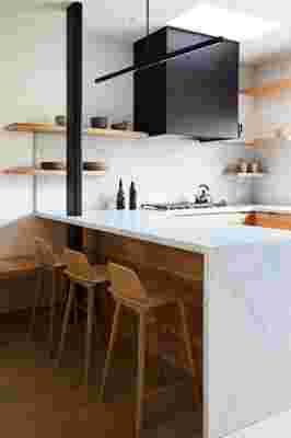
AFTER: Jesse and the team switched things up by installing open cabinetry and sticking to a palette of black, white, and wood. “It needed to feel as interesting as possible while also feeling as large as possible,” she says.
This simple palette of black, white, and wood is a far cry from what the home used to look like. Nick bought the property for its location, set a few blocks from the city’s famed Abbot Kinney Boulevard, and not necessarily for its looks. That’s because the home was a kaleidoscope of colors, filled with a rainbow in every room and accented with materials that had seen better days. Its floor plan didn’t help, either, since its choppy layout made spaces feel more closed-in than connected. Nevertheless, Nick saw the home as an opportunity for quality development—it just needed a complete overhaul first.
BEFORE: “Although the color was so happy, it wasn’t planned very well and it was out of date,” Jesse says. “It felt a little chaotic.”
Your comment