Interior Decoration Design
This Playful Brooklyn Brownstone Has a Kitchen Floor You’ll Definitely Want to Recreate
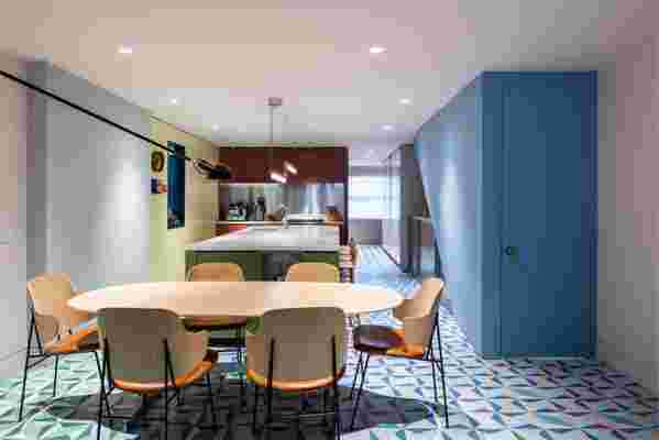
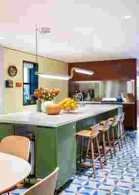
The color gradient in full view, with encaustic cement tiles in custom colorways by The Cement Tile Shop . Comprising 2,800 tiles in 17 unique color schemes, the gradient moves from black, white, and blue near the ground floor entryway, to green and pink hues in the kitchen and lounge, finishing with a red-and-ochre palette on the terrace.
It’s a pretty regular occurrence that we come across a space and think, “ Hey, how’d you do that? ” From custom built-ins to expert styling to genius pattern combinations, pros in the interior design business know just what to do to make a room or a home or even a coffee table stand out. So with this series, we’re asking them to let us in on their secrets in the hope that we can take our own spaces to the next level.
From the second we first saw this kitchen, we were utterly enthralled. Situated in a historic Clinton Hill, Brooklyn, brownstone, the graphic, gradient-hued floor stands out. We sat down with architect and designer Michael K. Chen of Michael K. Chen Architecture to hear about the influences behind the design, how he brought this unexpected vision to life for his clients, and how you can create the look too.
Clever: What were some of the initial inspirations for the space?
Michael: The clients had a vivid memory of vacations in Mexico, and always loved the look of multicolored Mexican ceramic tile. That was the starting point. The clients brought a kitsch sensibility to the table—they’re young and playful. Because the floor was ‘the thing,’ we wanted the rest of the kitchen to be blocks of color . Each volume of the kitchen became its own color, and the walls and ceiling became another color.
How did you select the color palette?
We had epic color meetings. We looked at really large paint samples and just kept playing around with them. It almost seems quaint now: four people sitting around a table, just mixing and matching colors. It was sort of like kindergarten, in the best way.
The oversized kitchen island, with Muuto’s Nerd Counter Stools , makes for a perfect casual eat-in space. It faces a pegboard wall, which shows off pieces from the couple’s eclectic art collection.
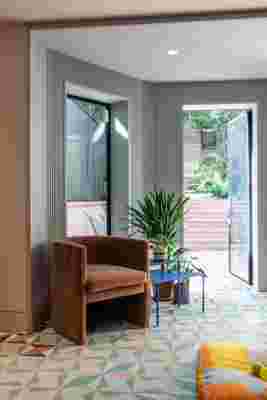
“One of the main draws of this house was the backyard—it’s unusually big for Brooklyn,” says Michael. The ceramic tile extends outdoors, leading up to a garden and lawn. An ARC Armchair by TRNK frames the back entryway.
What are your tips for executing color blocking?
It’s so important to see the colors working together and with the other materials. You want to see the colors repeatedly and over a certain amount of time, because color changes with light. We’re always thinking about the light, and how color is a vehicle for feelings and emotional states. We wanted a cheerful energy here.
Also, the way we usually think about color blocking has a lot to do with scale. The volumes in this space are somewhere in between the size of the furniture and the architecture.
There’s one wall here that is padded out because there’s a bunch of plumbing in it, serving upper floors. We painted that wall its own color, while the rest of the environment is a barely-pink color. And it allowed us to introduce this fluorescent yellow pegboard. We took something that was bothersome to us (there was no other way to hide the plumbing in the open floor plan) and utilized it to break up surfaces; it became an asset. Now, you get the sense that these volumes are floating and free.
Your comment